FACE / Digital brand system

The FACE styleguide.

One reference for every digital touchpoint. Brand foundations, reusable UI and practical rules for the people building FACE.

Explore the system ↓

01 / Identity

Make every touchpoint recognisably FACE.

Use the supplied artwork, a clear hierarchy and enough room for the content to breathe.

The approved wordmark

The bold FACE wordmark shown here matches the 2026 brand reference. Always place the original artwork; never rebuild the logo as text.

Space is part of the logo.

Keep a clear area equal to the height of the letter F on every side. Keep other text, images and edges outside that area.

Use white artwork on FACE blue or the FACE gradient. Black on white and white on black are the approved alternatives.

Do not stretch, rotate, outline, change the lettering or place the mark on a low-contrast background.

The PDF’s 12 mm minimum is for print. For digital use, check legibility at the final rendered size.

Source of truth: the June 2026 brand PDF defines identity, colours and typefaces. The spacing and responsive sizes below are digital implementation guidance for this website.

02 / Colour

A shared family. Distinct personalities.

Use the corporate palette for FACE. Apply division colours intentionally, alongside clear text labels rather than colour alone.

FACE — corporate palette

Dark blue

#235991 · RGB 35 / 89 / 145

Light blue

#32BCDE · RGB 50 / 188 / 222

Light grey

#F2F2F2 · RGB 242 / 242 / 242

FACE gradient

#235991 → #32BCDE

Dark blue is the corporate colour. Use light blue as an accent with dark text. Match the PDF gradient visually: dark blue at the upper left, light blue at the lower right. The PDF specifies −45° in its design application.

FACE PRO

Rich black

#000000

Dark grey

#3D3D3D

A monochrome identity. Use the white PRO artwork on rich black, with restrained texture.

FACE MI

Bright orange

#EAB431

Strong red

#DC1F27

FACE MI gradient

#EAB431 → #DC1F27

Pair the warm gradient with expressive artist photography. Use the white MI artwork on the gradient.

FACE DANUBE

Orange

#E9A039

Dark cyan

#03738C

Retain the FACE core palette. Use these two division accents selectively.

FACE ACADEMY

Primary blue

#1A4CCC

Accent blue

#316BFF

Titles

#1A2447

Paragraphs

#292929

Supporting neutrals: white #FFFFFF, light grey #F2F2F2 and grey #C0C0C0. For digital work, use the HEX values from the PDF.

Contrast rule: use dark text on light grey, light blue and orange; white text on dark blue, black and dark grey. Check the actual text/background pairing, especially over gradients and photographs.

03 / Typography

Clear hierarchy. Confident typography.

Montserrat for headings. Roboto for body copy. These specimens use the same shared classes as the rest of the website.

TYPE REFERENCE

H1 · Heading 1 · 48 px desktop / 36 px mobile

Ideas come to life.

H2 · Heading 2 · 36 px desktop / 28 px mobile

What you’ll learn

H3 · Heading 3 · 28 px desktop / 24 px mobile

Build your expertise

H4 · Heading 4 · 22 px desktop / 20 px mobile

Prepare your workflow

H5 · Heading 5 · 18 px desktop / 18 px mobile

Equipment requirements

H6 · Heading 6 · 16 px desktop / 16 px mobile

Software compatibility

Lead paragraph · Paragraph Large · 22 / 20 px

Connect with the people, products and knowledge behind exceptional experiences.

Body copy · Body Copy · 18 / 16 px

Good content makes the next step clear. Keep paragraphs focused, use bold for important phrases and give each idea room to breathe.

See these styles in a complete article

Caption · Text Caption · 13 px

Hands-on learning at FACE Academy. Image credit: FACE.

Use depth only when it adds clarity.

Most news and event pages need H2 and H3 only. H4–H6 are for genuinely nested topics in detailed technical content. Never select a lower heading level just to make text smaller.

  1. H1 — MA Lighting support guide
  2. H2 — Network setup
  3. H3 — Configure your connection
  4. H4 — Set a static IP address
  5. H5 — Windows configuration
  6. H6 — Advanced adapter settings

The H1 specimens use paragraphs with the Heading 1 class, so this styleguide retains one actual H1. Visual styling and semantic heading levels are separate decisions.

COMPLETE ARTICLE · Illustrative content

Better sound starts with a better workflow.

Explore the decisions behind a reliable live mix, from the first input to the final sound check.

Template header above · Rich text below

What you’ll learn

Develop a repeatable process that helps you work confidently, even when the schedule changes.

Start with a clear signal flow

Map the journey from source to destination. Identify where gain, processing and routing decisions happen so you can troubleshoot with purpose.

  • Create a clear input list and channel layout.
  • Keep routing consistent and easy to follow.
  • Document the decisions your team needs to know.

Make preparation repeatable

Build a workflow you can adapt across productions. Consistency saves time and makes it easier to hand over to another engineer.

Great preparation creates more space to listen.

A practical approach

  1. Prepare. Review requirements and plan your setup.
  2. Explore. Work through routing and mixing scenarios.
  3. Reflect. Compare approaches and identify your next steps.

Before you attend

Bring your questions and a challenge you would like to discuss. No two productions are identical, and that is where useful conversations begin.

Browse FACE events

Sample content for the styleguide; this is not an announced event.
04 / Controls

Every action should feel intentional.

Use a clear primary action, a quieter secondary action and visible keyboard focus. The examples below use real links and editable fields.

Default buttons

Hover these links or reach them with Tab. Labels describe the destination or next action.

On a dark surface

Back to the brand ↑

Use the inverse treatment for clear contrast.

Hover / specimen

Explore patterns →

A clear colour change reinforces the interaction.

Keyboard focus / specimen

Focus remains visible against both light and dark surfaces.

Unavailable / specimen

Registration closed

No link, no pointer interaction. Explain why the action is unavailable.

Form fields

Interactive specimen — typing here does not submit any data.

Thank you! Your submission has been received!
Oops! Something went wrong while submitting the form.

Feedback states

Email address — error specimen

name@example

Enter a valid email address, for example name@example.com.

Success specimen: Your request has been received. We’ll get back to you soon.

Use persistent labels. Connect helper and error messages to their fields. Explain errors in text; do not rely on colour alone.

05 / Layout

A consistent rhythm across every page.

Align section headings, banners and grids to the same 1440 px outer container. Use generous whitespace and reduce columns as the screen gets smaller.

The spacing scale

8 px

16 px

24 px

32 px

48 px

64 px

96 px

8–16 px within controls · 24–32 px between related items · 64–96 px between major sections.

Container and breakpoints

Desktop: max-width 1440 px, centred, with 40 px inner gutters. At a 1440 px viewport, content starts 40 px from each edge.

Tablet: 32 px gutters and two-column content grids. Mobile: 20 px gutters and one-column content.

Upcoming events: 4 desktop columns. Previous events: 5 desktop columns, maximum 6 items. Keep previous cards non-clickable.

Use the same container for hero text and the section below it. Avoid independent offsets that make headings drift.

Four-column grid specimen

Column 1

Column 2

Column 3

Column 4

Corners and borders

Cards: 12 px radius with a subtle 1 px border. Fields: 8 px radius. Buttons and category pills: fully rounded.

Use a border to frame news and event items, as shown in the brand reference.

Images and cropping

Choose a consistent image ratio within each grid. Use cover for editorial imagery and contain for logos or product cut-outs.

Keep faces, products and important lettering away from crop edges. Review the mobile crop before publishing.

06 / Patterns

Build with complete, reusable patterns.

These are visual specimens with real imagery. They show hierarchy and behaviour without pretending to be actual scheduled events.

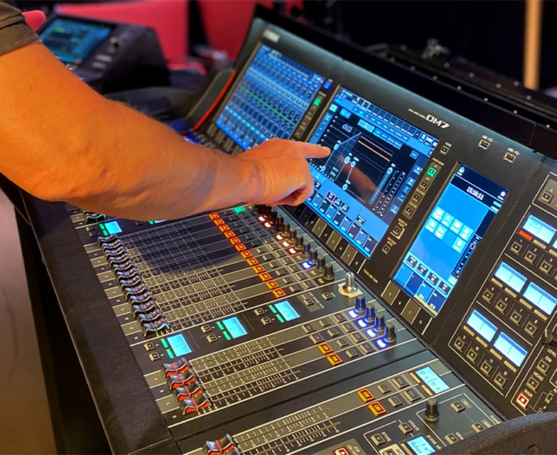
Hands-on training at an audio mixing console

FACE PRO · Upcoming specimen

Hands-on knowledge. Real connections.

Event date · Location

Show the topic, who it is for and the practical details before asking someone to register.

Browse upcoming events →

Audio console used during a previous training session

Previous event · Specimen

A moment worth looking back on.

Past event date · Location

A past event is informational. Keep the image and title visible, without a link or registration action.

Past event · Not clickable

Event detail pattern

1. Title and short introduction.

2. Date, time, timezone and location.

3. Who it is for and what to expect.

4. Programme, speakers and useful details.

5. Registration, only when a link exists.

View events →

Image banner specimen

FACE / Photography

KNOWLEDGE SHARED. IDEAS AMPLIFIED.

Uppercase headings on photography. A dark overlay keeps the message legible.

Navigation system

Reuse the shared Navigation Solid Fixed, Navigation Scroll Animated and Navigation Transparent components.

Use the same link order and Store button throughout. Keep the transparent desktop header transparent; use a light-grey mobile rollout with dark links.

The shared navigation at the top of this page is the live component. Do not rebuild it from independent guide links.

Filters and registration

Use All, FACE PRO and FACE MI above collection grids. Follow the homepage’s Finsweet attribute pattern and include a clear empty state.

Show the registration action only when the CMS registration URL is filled. Use a descriptive label and make external registration destinations clear.

Keep the entire upcoming event card clickable to its CMS page. Avoid nesting another link inside that card.

07 / Content

Make publishing predictable.

Give every content item enough information to make sense on its own: on a card, in search results and when shared.

Photography

Show real people, products and audiovisual experiences. Choose a clear subject and a deliberate crop.

FACE MI uses expressive artist, guitarist and stage photography, primarily black and white alongside its warm gradient.

Use meaningful alt text for informative images. Decorative backgrounds should not repeat the heading for screen readers.

Event CMS essentials

Required: event name, slug, summary, main image, division, start date/time, timezone and location.

Optional: end date/time, registration URL, registration label, price, programme, speakers, accessibility details and organiser contact.

Use an end date/time when available to decide when an event becomes previous. Sort upcoming events chronologically.

SEO and sharing

Write a specific page title and a useful description. Each CMS event should describe its own topic, date and location.

Use a relevant landscape Open Graph image, ideally 1200 × 630 px. Keep any essential text inside the central safe area.

Avoid repeating one generic description or hero image across every event.

Rich text and voice

Write directly, clearly and with practical detail. Keep paragraphs short and headings descriptive.

  1. Explain what the visitor will gain.
  2. Provide the information needed to decide.
  3. Offer one clear next step.

Use proper heading levels, descriptive links, concise lists and genuine quotes. Never leave template copy in published content.

08 / Quality

Ready to publish?

A short review protects the experience on every screen.

Visual and responsive

  • Header and content align at 1440 px.
  • Cards reflow cleanly on tablet and mobile.
  • Images load and crop correctly.
  • No empty content blocks or template text remain.
  • Mobile menu is legible and sits above page content.

Interaction and content

  • Keyboard focus is visible and links work.
  • Fields have visible, connected labels.
  • Filters show results and an empty state.
  • Past events have no clickable card or registration.
  • Registration appears only with a valid CMS URL.
  • SEO, sharing image and alt text are complete.

Maintain the system: specimens use the website’s shared heading, button, form and card classes. Changes to those shared classes affect every instance using them. Styleguide layout, swatch and demonstration classes are named Styleguide and only organise this reference page.